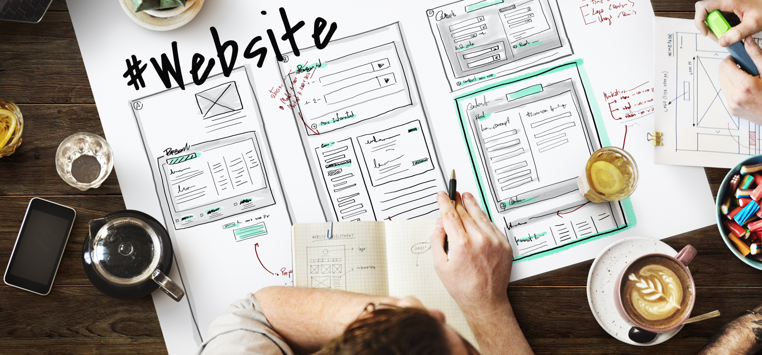
Web optimization is a process used to maximize the number of visitors who make a purchase online or begin the transaction process by contacting you. In this series, we’re looking at some of the factors involved in optimizing your website.
“Design” includes colours, fonts, shapes, and layout. “Navigation” includes the actual structure of pages and how they are linked together, as well as the presentation to users that allows them to get to the various pages.
While you always want your design to be appealing to your target market, it also needs to be purposeful, and can be helpful in building trust, keeping attention, and aiding in navigation. Let’s look at some specifics.
The design is consistent with the brand and throughout the site. Between hackers and scammers, how’s a person to know if they’ve landed on a legitimate and secure site? It’s definitely getting harder, so the little things count; like putting your logo front and center, and ensuring the colours and other design factors are consistent with your brand. For example, most of us are familiar with the Coca-Cola brand. Now, if you landed on a website that was supposed to be Coca-Cola’s but the main colours on the site were green and yellow, or the iconic font was switched to Times Roman, we’d get pretty suspicious. So, go with what your customers know.
Consistency in design and layout on all pages, assists users to navigate the site (e.g. the menu bar stays put) and provides confirmation that they have not clicked on to an external location.

The web design and optimization assists with user navigation and interaction. Underlining links has become passé, but it is helpful to make links noticeable by using a different colour or font. If you have forms, calculators, or similar resources on your site, make it obvious what is intended to be input, and where it goes. Faint font italics that say something like, “Enter your name here,” are one example of how to avoid user frustration.

The design layout changes for optimal use on any sized device. This is very important these days with the number of people who access the web with their phones; but don’t forget about tablets, mini-tablets, and big screen users. What you want is a design and layout that recognizes each different type of device, and automatically alters itself.
Continued:
Web Optimization – Part 1: The Home Page
Web Optimization – Part 2: Design & Navigation
Web Optimization – Part 3: Features & Functionality
Web Optimization – Part 4: Content
Web Optimization – Part 5: Performance

